December 31, 2020
Shiny and new
It’s been over 5 – almost 6! – years since I’ve updated the blog. The blog used to be super active, sometimes with multiple posts a day, covering everything from the post-renovation pictures of our house in Austin, to what is still the best meal I’ve ever had, to a post about an epic trip to FSU, complete with football game photos, to my advice about publishing, to the time Loki, our beloved former cat, got high on catnip, to… well, a lot has been covered. But then I, like many, turned more often to Facebook or Instagram to share things. It’s a lot easier (i.e. lazier) to post two sentences with one picture than to post a full story of a trip with a dozen pictures all at once, but it’s definitely much more disposable.
I’d love to blog more, and I’ll make an effort to do that. In the immediate-term, though, the reason for THIS post is that this is a BRAND NEW, SHINY WEBSITE!
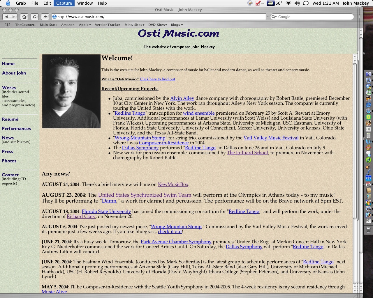
For some history, here’s what my first website looked like…
Frames! NEWS! Textured “wallpaper!” Colors and fonts that only I thought were acceptable!
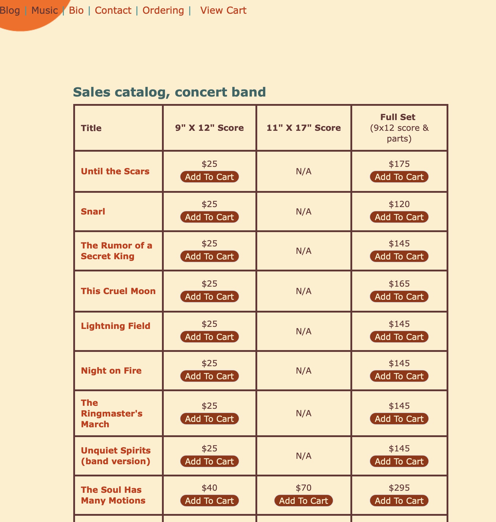
I don’t know when the site was eventually re-done – around 2006, I think? Just to document it, here it is:

This worked fine for a while, but when you’re looking for a piece, you had to just… scroll.

You couldn’t sort the titles. Some pages used an embedded MP3 player that stopped working well a few years ago, so you could hear maybe two minutes of a piece and then it would just START OVER. Some audio was on Soundcloud. Adding a new piece required manually coding a new php page, because every page was a standalone page – not from a database. It was… a mess.
But then I saw Michael Markowski’s website, and was blown away, not only by the functionality of it, but how CLEAN the design is. I asked him who his designer was, and was told that she didn’t have time to do my site. After MUCH pleading, she agreed to take on the project.
This was all nearly two years ago. It was very hard to find a developer who could handle all of the custom coding that I wanted. What’s custom? Well, here’s one example. I wanted the customer to be able to rent a piece of mine, and not have any back-and-forth regarding the paperwork. In the old days, here was the process:
1) Visit my website
2) Find the piece you want via a mess of links
3) Visit that page
4) Figure out that if you wanted to rent it, you’d “Click To Buy,” even though the piece was a rental
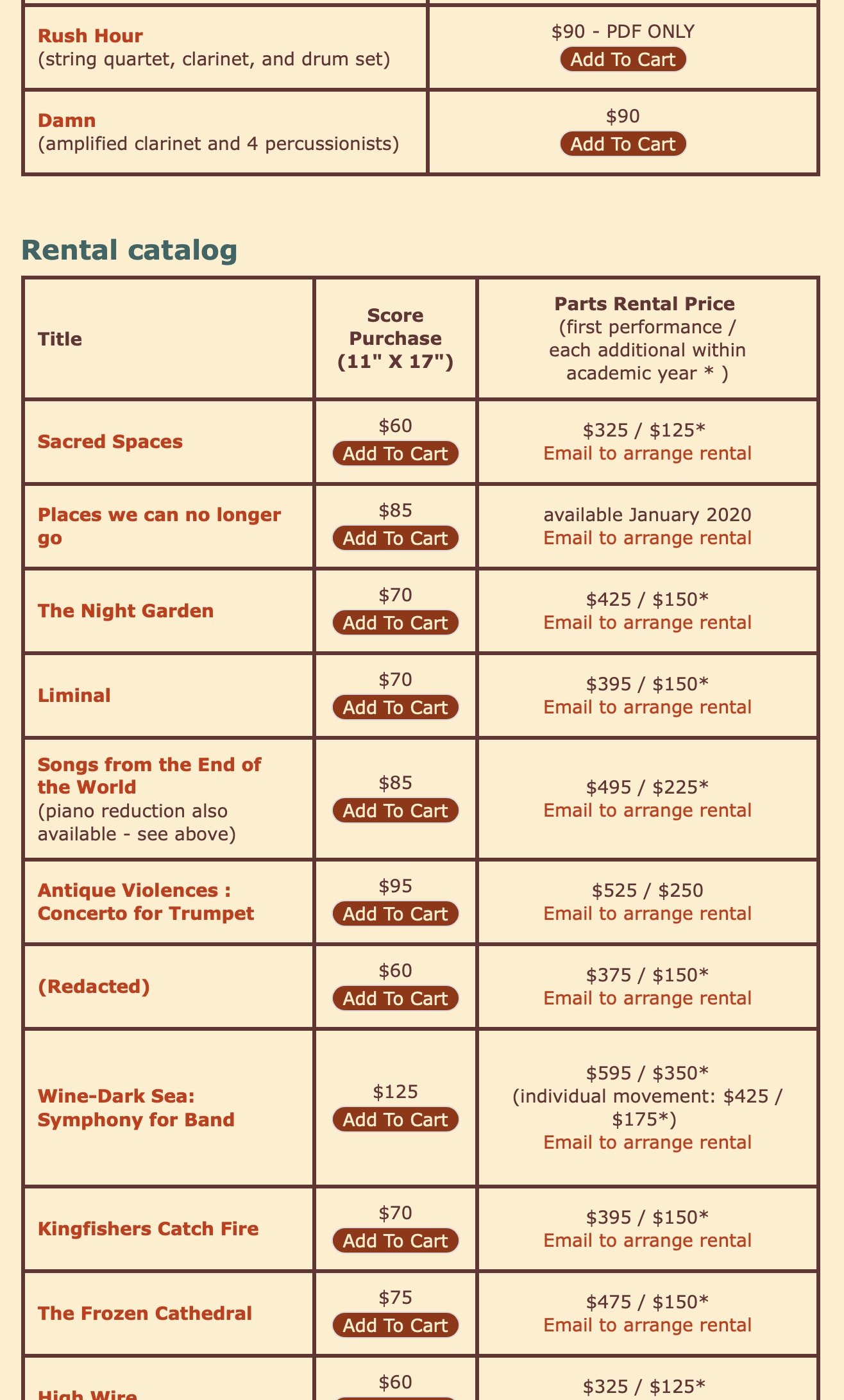
5) You’d end up on the list of my ENTIRE CATALOG.
6) You’d scroll until you found the piece again on that ever-lengthening list…
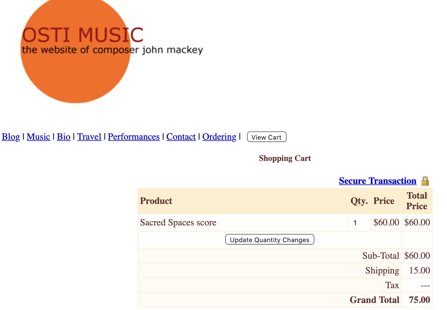
7) You’d see that you could buy the score, so you’d click “Add To Cart,” and you’d find yourself on a new page showing your cart. A page that didn’t look like the rest of the site, because the credit card processing company I’d been using broke the way it handled templates:
8) You’d maybe finish your order, then realize you had only ordered the score, not the parts, so you’d have to go back to that list of pieces and realize there was a separate link so you could set up the rental.
9) You’d type an email to my business manager, Sarah, saying you wanted to rent the piece
10) Sarah would reply, asking for a bunch of information – the performance date(s), the billing address, whether you wanted to pay with a credit card or a check – stuff like that
11) You’d reply, and you’d forget some piece of info, so she’d write you back, asking again
12) You’d give that info, and she’d manually write up a rental agreement and an invoice and email those to you
13) You’d sign the rental agreement, email it back, and pay the invoice
14) Sarah would send you the PDF of the parts
15) After your concert, you’d try to remember to mail a program to Sarah, so we could document the performance for BMI licensing
16) You’d forget
17) Sarah would email you, asking for the program, which you’d send
18) Once every 5 years or so, I would add your performance to a list on the website, but that was a single webpage, with all manually-entered text. I eventually gave up on that, so there was no way you could see who played what, when, but even if you had wanted to, you’d have to SCROLL THROUGH A NON-SEARCHABLE LIST OF LIKE SIX HUNDRED PERFORMANCES IN CHRONOLOGICAL ORDER.
Well, that sounds just miserable. I can’t believe anyone ever ordered anything.
I wanted it to be easy for everyone. And now it is.
Now the process is:
1) Go to the Music page, where you can see basically every piece I’ve written since I was 15. You can search by category, difficulty, title – whatever. You can even hear pieces you’d never have heard otherwise!
2) Go to the page for the piece you’ve selected.
3) Select how many scores you want, then select the performance date(s) from a clickable calendar.
4) Add those to your cart.
5) Go through the checkout process, where you’re presented on-screen with your rental agreement, which you click to agree.
6) You receive your watermarked set of parts within seconds of checkout.
7) Your performance date(s) automatically go onto the Performance Calendar.
8) Your performance information automatically goes to BMI.
9) You have a GREAT PERFORMANCE and were so thrilled by the ease of the experience that you immediately come back and order more.
Finding a developer who could code it – and make it look like the beautiful design! – was not easy. I eventually found somebody in France – a friend of a friend – and he was unbelievably slow, but he seemed good. Then he begged me for the rest of the money with the site maybe 60% done, I agreed, hoping it might speed things along, and he GHOSTED ME. So I didn’t have to just find somebody new – I had to find somebody who wanted to finish the site AND fix all of the bugs that still existed in the other developer’s code.
I did eventually find somebody wonderful, and finally – here we are! A new, beautiful site, with tons of functionality that will make it easier to find music, listen to music, and order it.
I’m pretty excited about it. And I’m happy you’re here!
Comments
Add comment