April 29, 2011
Asphalt Bleep Bloop
A high school student named Erik Mott has programmed just about every one of the eleventy-seven zillion notes of “Asphalt Cocktail” into Mario Paint Composer. I am honored that somebody thought the piece was worthy of this 8-bit glory.
I really, truly love this, because it takes me back to what ALL of my music sounded like when I was writing it on a Commodore 64 back in junior high (and I kept writing on that computer into my freshman year of college). It’s like going back in time and meeting my 1984 self and telling him to write Asphalt Cocktail.
And it’s not just that Mr. Mott took the time to program this, which took him months. It’s the fact that he made it sound good. Really, really good. There’s attention to voicing, dynamics (probably the most impressive element of his interpretation), and the percussion writing. He even made the clarinet solo sound cool, going as far as to program in all of the pitch “falls” that are in the part. Erik Mott: you are my new favorite person * .
* You may or not actually my favorite person, but I’m definitely a big fan.
April 6, 2011
Interior Design Photography
Recently, I posted a blog entry with loads of pictures of the inside of our house in Austin. Those pictures were for our real estate listing and brochure, and they looked great. Our realtor, though — who is wonderful — wanted to get more specialized pictures of the interior for use by her firm in future advertising, etc. So, even though we already had perfectly good pictures, she brought in Paul Finkel, one of the best interior design photographers in Austin. The results are pretty incredible. He was at the house for over three hours, and most of these were shot with the lamps turned off, and with minimal light at all. I kept wondering how the pictures wouldn’t be dark, but as you’ll see, they’re extremely bright, and the colors are spot-on and vivid. He shot everything with prime tilt-shift Canon lenses.
Here’s my studio: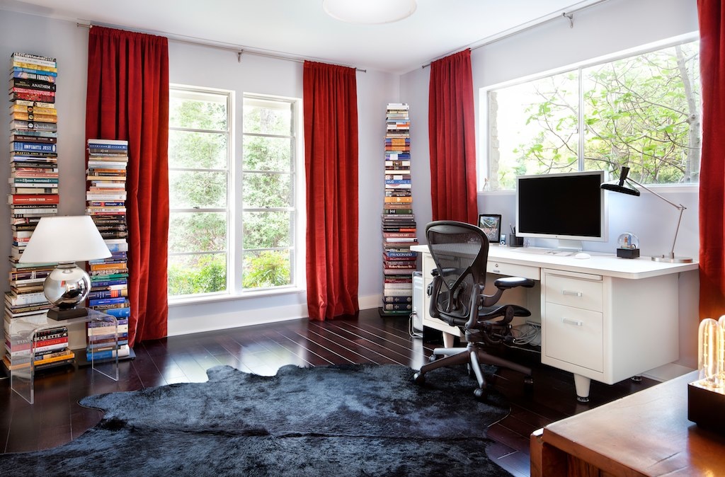
The living room, looking into the foyer. (AEJ made that massive painting.)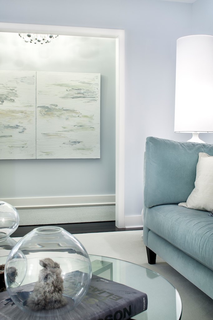
The living room, looking towards the dining room.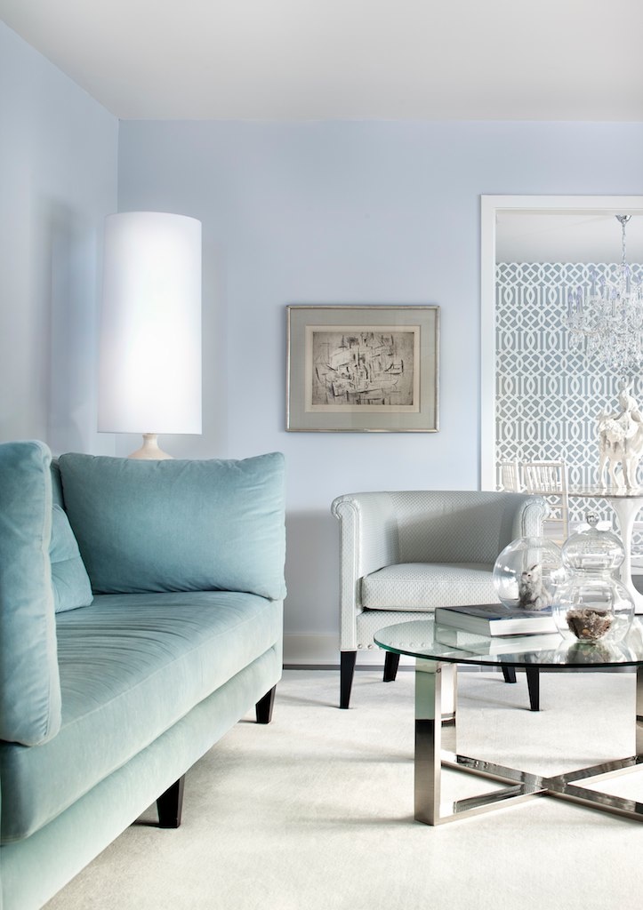
A slightly different view, capturing things like the “critter sculpture” on the dining table, and the “angry bunny” under the glass globe.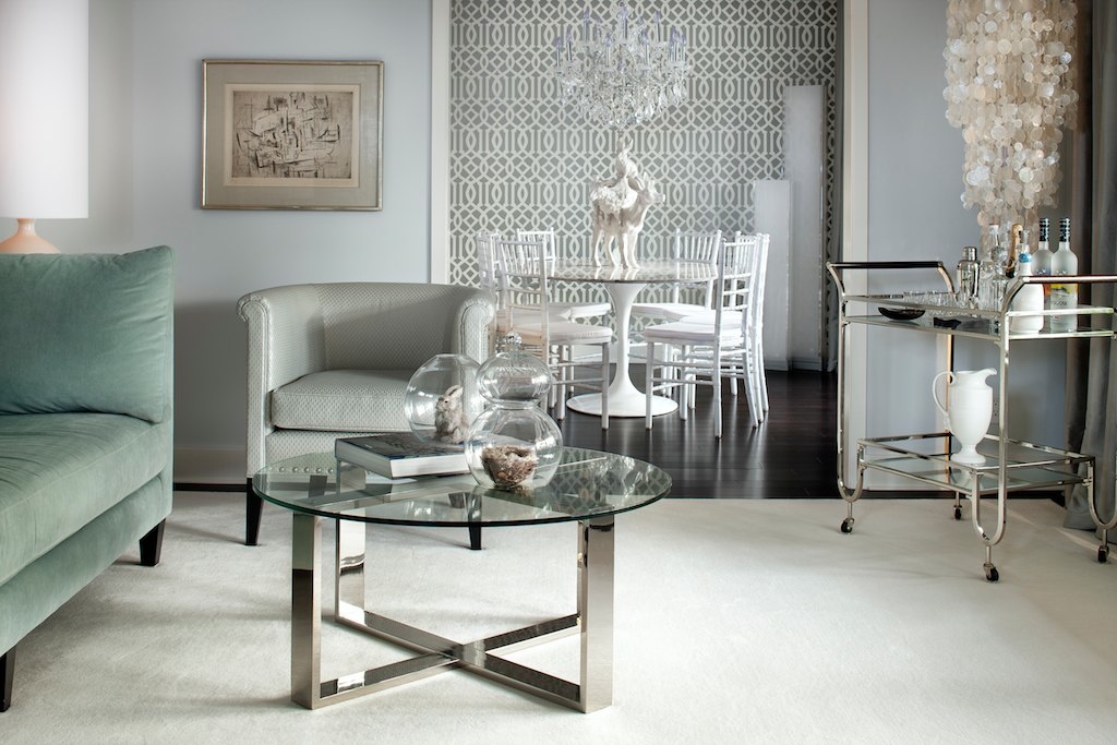
Yet another. I just love the way he framed this one.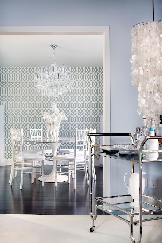
Speaking of framing, this is great. This is the master bedroom. That headboard is custom, made per AEJ’s specifications by a local upholstery firm.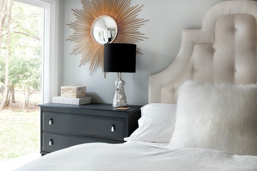
Another shot of the master.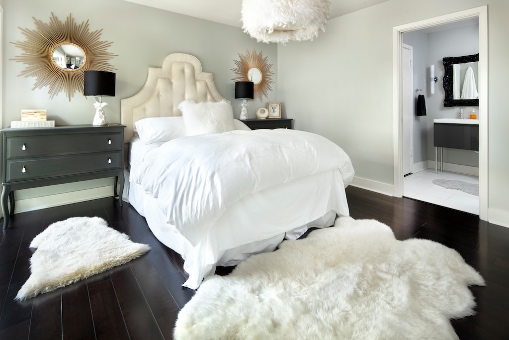
This is the guest bath, which really isn’t so special, but check out how he framed it, managing to capture the shower curtain perfectly in the mirror. Also, the way the color of the hand soap really pops against the otherwise black, white, and gray room, is really striking.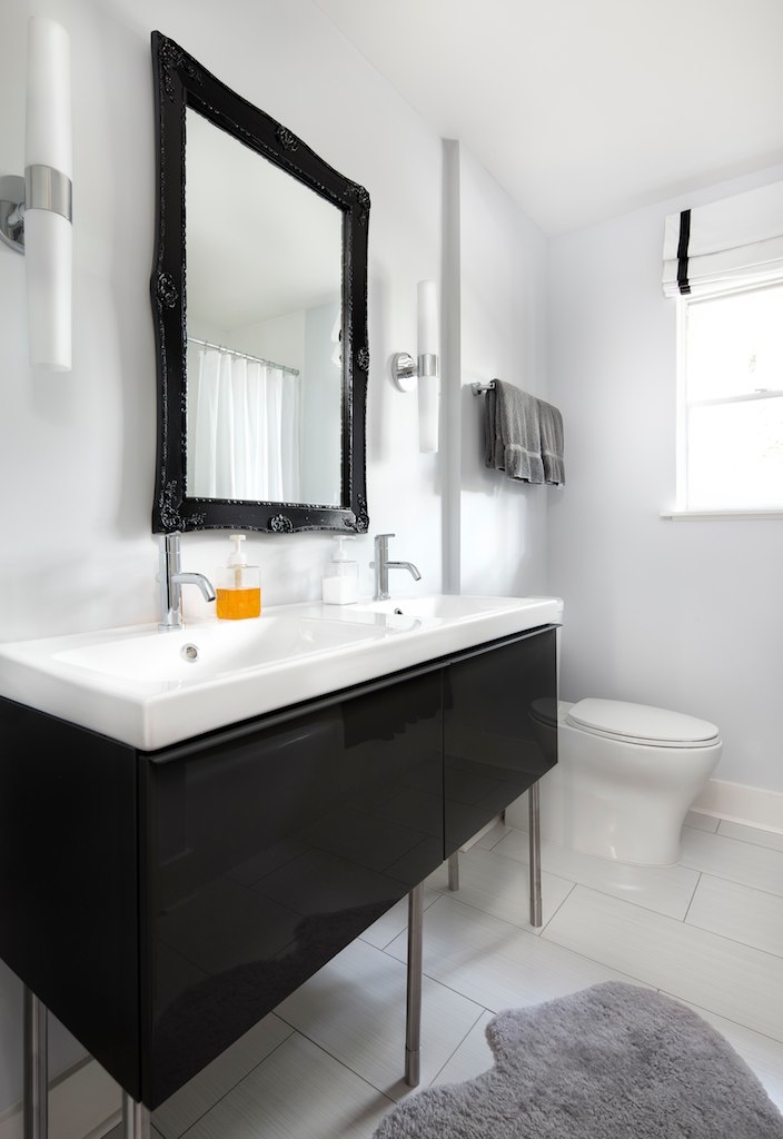
Yes, our kitchen really is just about this white. It’s hard to make them out, but that bowl on the island is holding custom mints labeled with our address. (That was AEJ’s idea, and I think we’re going to start seeing realtors all over Austin use the same trick.)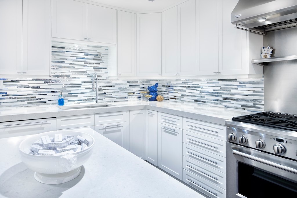
This one is fun just because of the way the blue pops. (Can you tell that AEJ likes white, black, and blue?)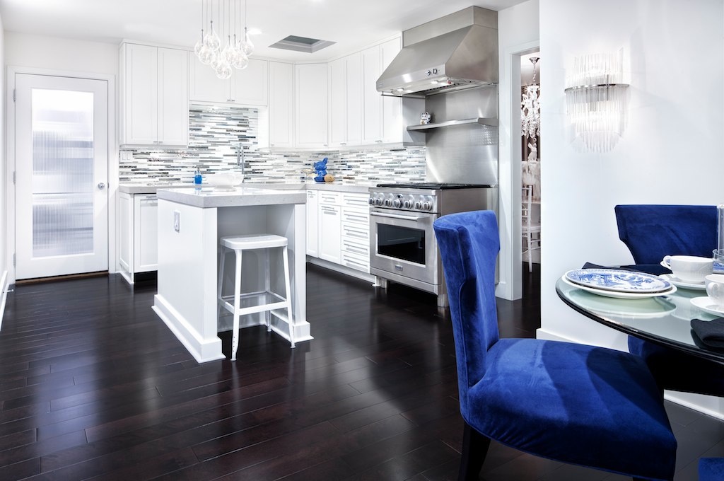
And another.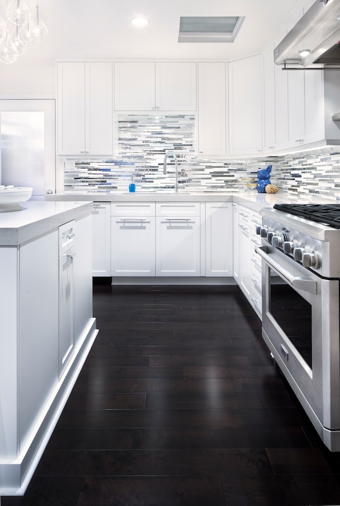
Here’s a detail of the crazy custom glass backsplash.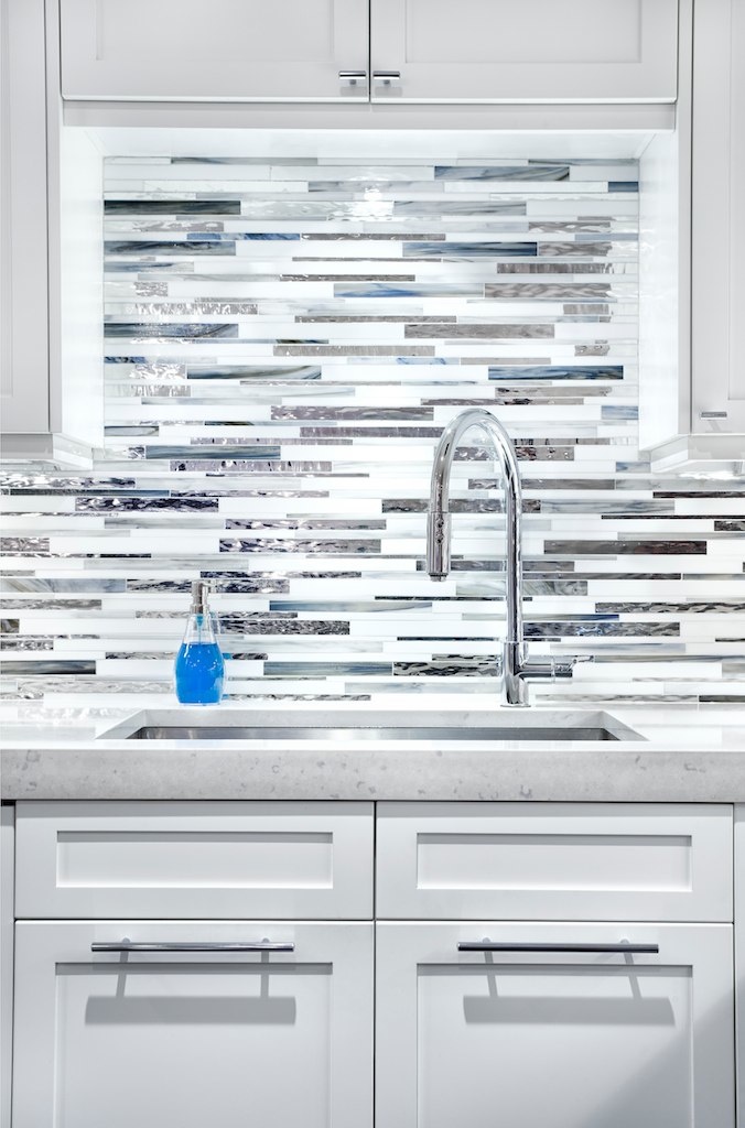
This one shows the other wall, with the second oven, the integrated fridge, and the built-in espresso/coffee machine. I am so going to miss that coffee machine…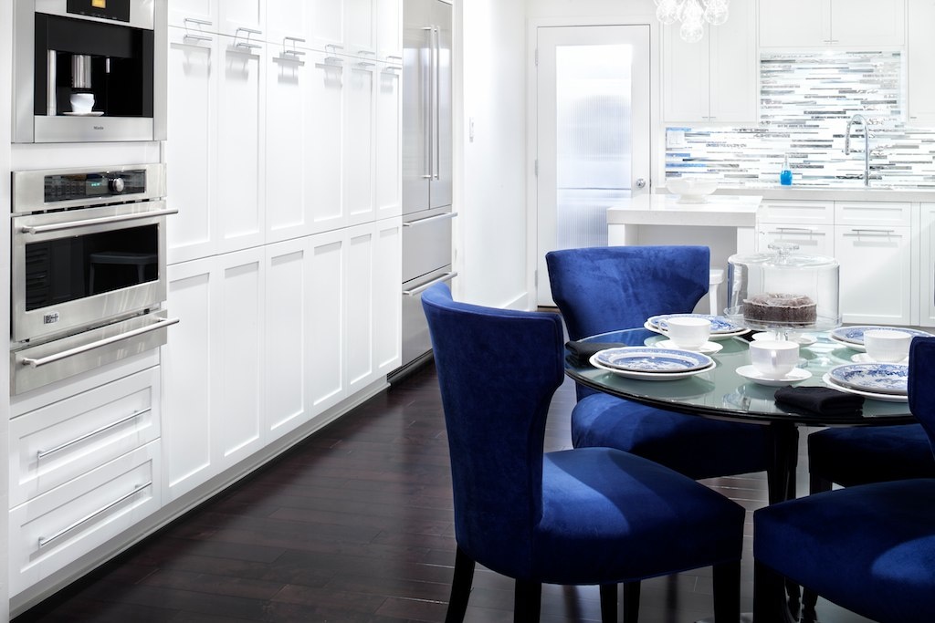
The laundry room. Nothing fancy, but bright, and shot well.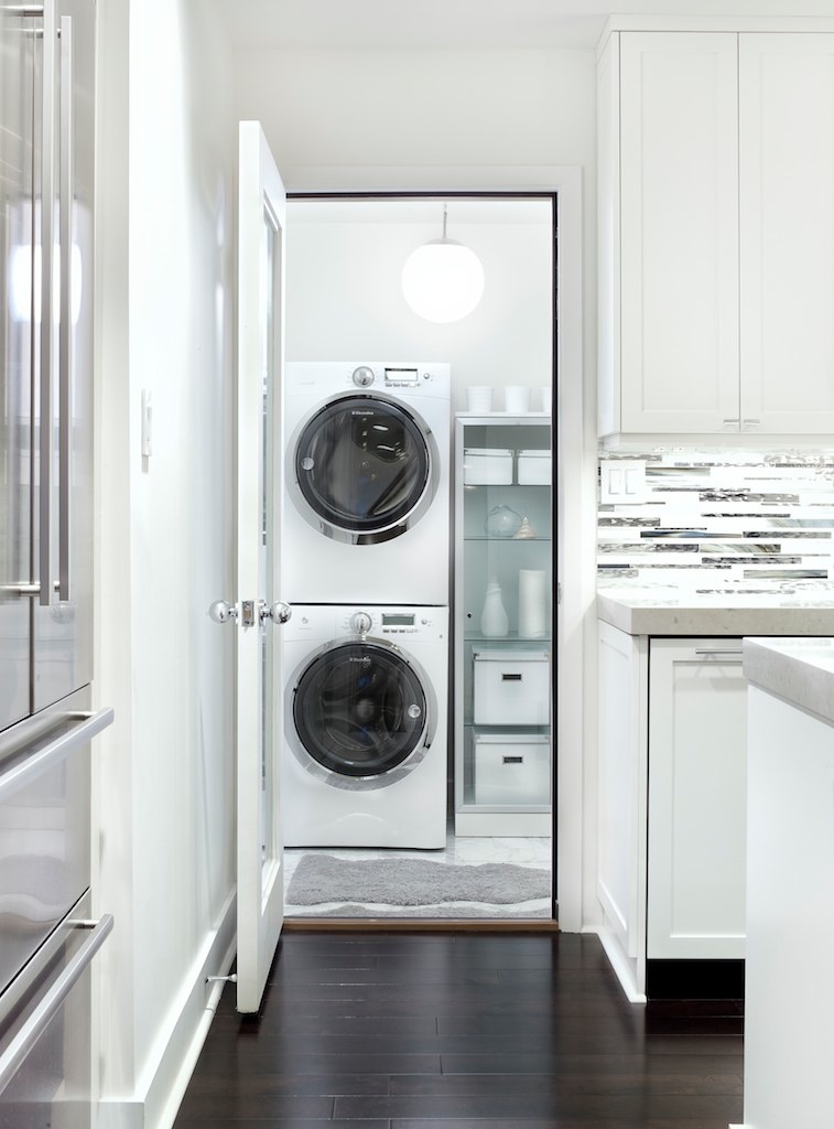
The family room, with the shiny speakers.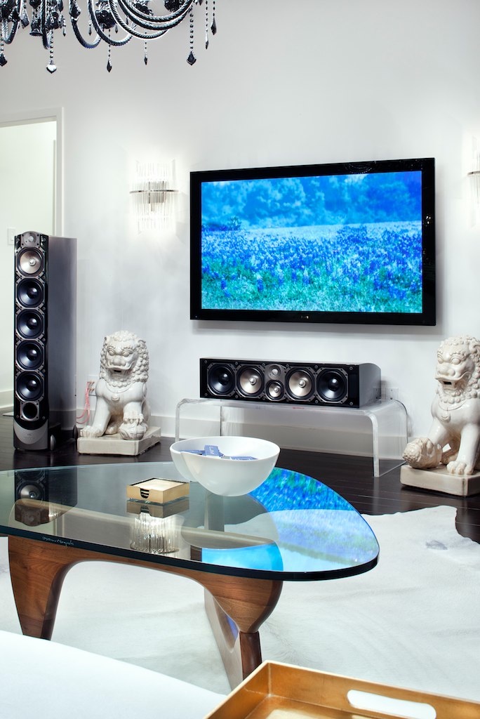
Another shot, showing the chandelier and the re-framed and re-clad fireplace. This was shot with the lights barely on.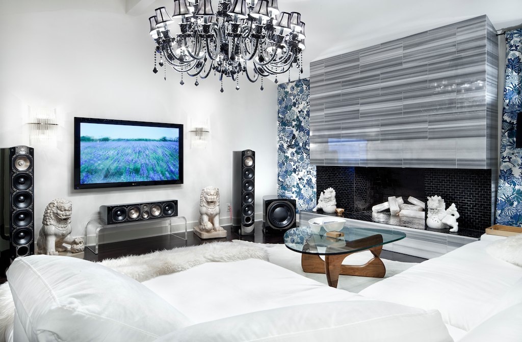
And another angle. As you can see, AEJ likes fluffy things.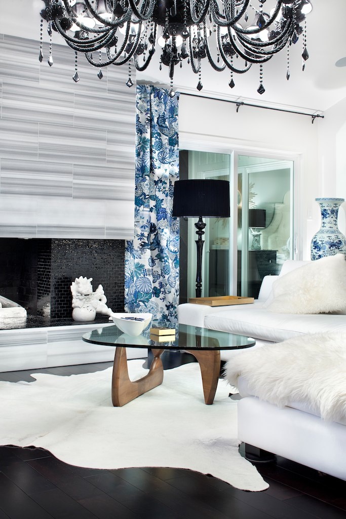
And lastly, here’s the foyer, with AEJ’s custom-designed 48″-wide front door, her painting, and a sweet ceiling light. I love this shot.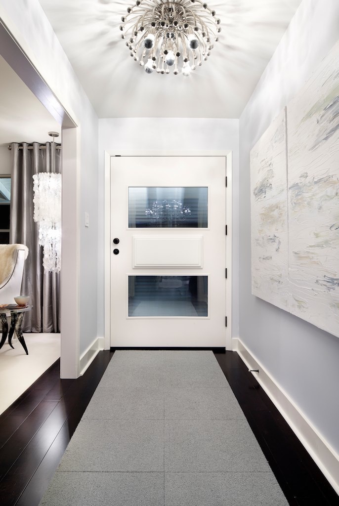
It’s pretty amazing what a professional architectural photographer can do. Note that with all of the wide-angle shots, there is no distortion on the edges, thanks to his skill with the tilt-shift lenses. Everything was shot fully-manual. This guy is incredible.
View Comments
Comments
Architectural Digest great.
You know, not to get religious here, but when I look at these photos, I can't help but wonder, if Jesus had a modern day house...
I call dibs on the book shelves in your study.
Really great shots John - looks fantastic!
I like the way the blue pops out... its kinda fun!
I think you're the only composer I've seen who's studio doesn't look like a tangled mess of wires and hardware.
Beautiful house, Mr. Mackey! Love the 'white' theming.....its very nice.
http://kyleroderick.weebly.com/1/post/2011/04/what-renting-out-scores-can-buy-you.html
This is a great blog. The interior design is so wonderful and elegant. I really like the living room design, the chair and tables are wonderful and the Chinese figures add to the design and the chimney.
I love everything but the one that really amazed me is your studio. I love the way books are stacked and the office space is very convenient and very relaxing for sure while doing your daily job at home. Setting an office space in your house nowadays is somewhat a necessity that is why if we are going to do it, go do it right. I have been looking for office space design in the internet for quite some time and it is great that I visited this site. Some may say that it is just camera works that makes it look amazing but the overall design really is fantastic.
Add comment
March 18, 2011
Hymn to a Blue Hour recording
A few weeks ago, I visited the University of North Carolina at Greensboro. They brought me in for the annual honor band and conducting workshop, and also for a recording session. (More on that in a moment.) Upon arrival, I had a fun rehearsal with the honor band on “Undertow,” which was being conducted by Richard Floyd.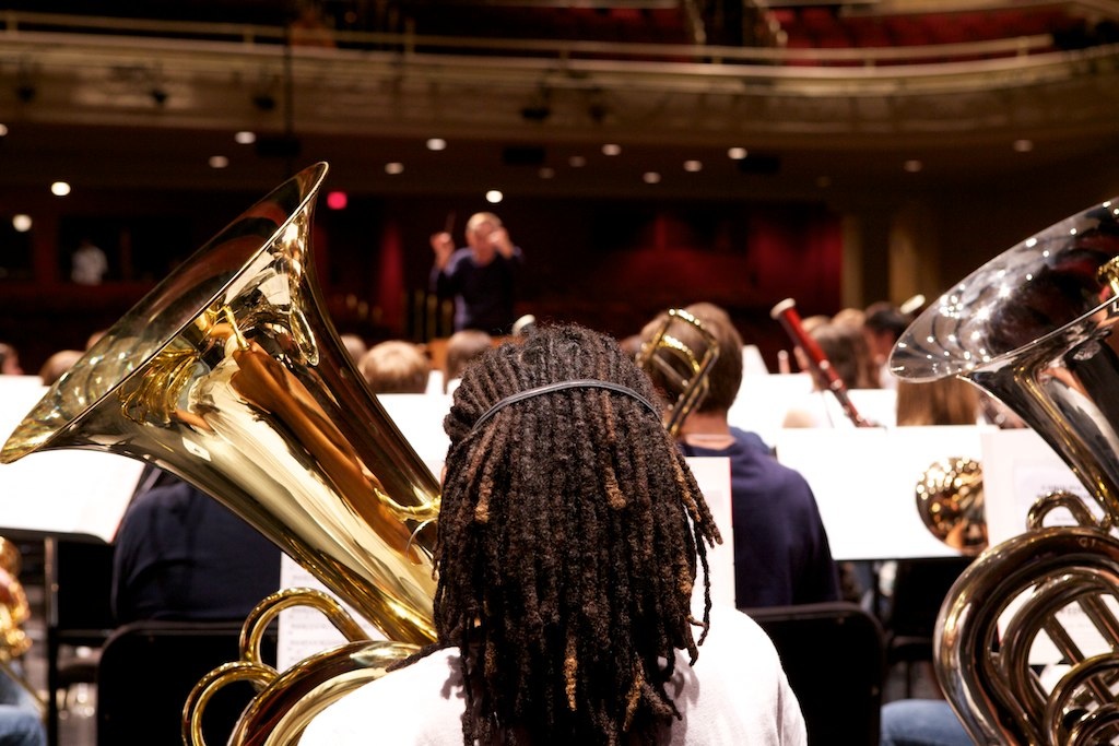
That night, the UNCG Wind Ensemble, under the direction of Kevin Geraldi, gave a beautiful performance of my new piece, “Hymn to a Blue Hour.” As I said on Facebook after the concert, it was among the best performances I’ve ever heard of any of my music in any medium. Kevin Geraldi is, as they say, the Real Deal. I couldn’t believe the amount of luscious rubato that Kevin accomplished. (I love for the piece to be incredibly free in tempo, almost like a Chopin Ballade.) It was gorgeous. Fortunately, we also made a recording. (More on that in a moment.)
But first, we had a tasty dinner, and wine.
Some people think it’s odd that I photograph my food. At UNCG, John Locke, the Director of Bands, does one better: he films people taking pictures of food.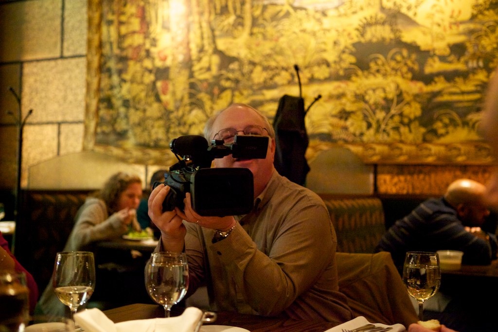
Did I mention that we also had a recording session for “Hymn to a Blue Hour?” ‘Cause we did.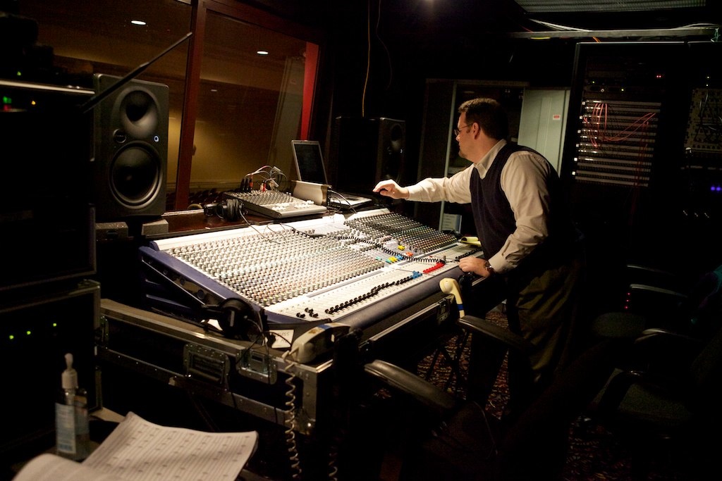
We spent about two hours recording the piece on Sunday night.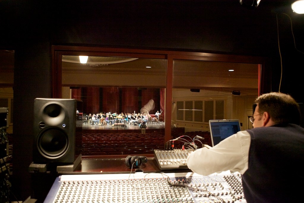
I received the master recording on Tuesday morning, edited it on Tuesday and Wednesday, submitted it to CD Baby on Wednesday evening, and on Friday afternoon, it was on iTunes. Less than a week from session-to-iTunes has got to be a record (pun intended).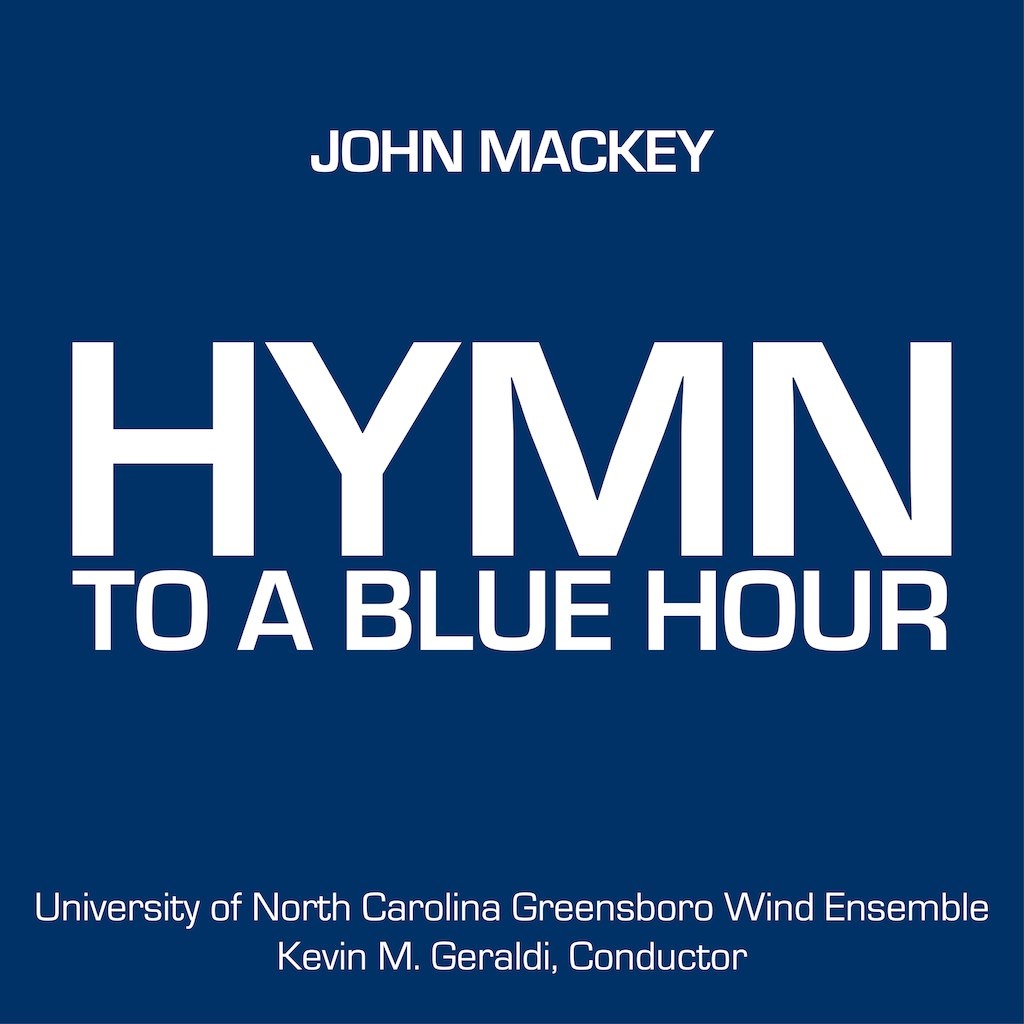
I hope you’ll check out the recording. It’s a stunning performance.
View Comments
Comments
I adore this piece of music and am so glad to have had the opportunity to play it and be part of the recording. Thanks for writing it!! And we had a blast with you at the ABA Convention partay!
Janet Phillips
John, I really enjoy this recording. (I got it on iTunes!) and your writing, musical and non. Keep it up and thanks for being a great example of making your way in the world as a concert composer.
View Comments
Comments
Wesley says
I was in the All-State band with one of the kids that helped on this. I think it's safe to say that Concert band was the coolest one there this year.
brandon says
16-bit glory* ;)
Peter J Felice says
This is EPIC. Thanks for sharing....I've given you credit for your 8-bit comment on my facebook. Hope that's ok...
Robyn says
Wow. That's kind of amazing.
Add comment